Some people say it naturally looks uncanny for them, but it doesn’t happen to me, I can’t really spot them… One trick to try is counting the fingers, but what else can I do?
Small details in the background tend to get more garbled than stuff in the foreground. A human artist would get vague, an AI will try to draw four different versions of the same thing in the same physical space.
The biggest tell is just “would a human draw this” though. Weird composition, people just kind of posing vaguely and staring off into the middle distance for no reason, uniform level of detail regardless of how important that part of the image is.
uniform level of detail regardless of how important that part of the image is.
That’s a good tip right there. I think I can notice AI slop pretty often, but I can’t always put my finger on why. I think this may be it.
Ooh true. Conservation of detail is a hard and inescapable factor in art. You have to make decisions about where you focus your time. Once you hit your thirties detail begins to very literally cost pain and you have to weigh the effort you’re putting in against what it will cost you in pain in your hands. Most artists don’t waste detail where it isn’t needed.
- AI is still dodgy when it comes to hands, though this isn’t the sure tell it used to be. Count fingers first, but also look for fingertips that seem to split/merge, weird fingernails, and unnaturally bent fingers.
- Try to read any text in the image. Missing/extra letters are common, as are nonsense words and misplaced punctuation. The smaller and more verbose the text, the more likely the AI will fuck up.
- Check in particular for weird/smudgy text in the corners of the image. Sometimes the AI copies artist signatures. It never copies them correctly.
- Coat/shirt buttons. Check the buttons one at a time first, and if none of them seem wrong individually, then compare them to the others to see if they are consistent.
- Look at any visible characters’ eyes, and in particular the irises. AI tends to generate weird fragmented/lined irises.
- If the image has any surfaces that are reflecting nearby objects (not just mirrors, but things like polished wood), check for discrepancies between objects and the reflections of those objects, or for reflections that are missing entirely.
This whole arms race of trying to look for new “tells” as AI images get harder to distinguish from genuine ones reminds me of this Terminator quote:
The 600 series had rubber skin. We spotted them easy, but these are new. They look human — sweat, bad breath, everything. Very hard to spot.
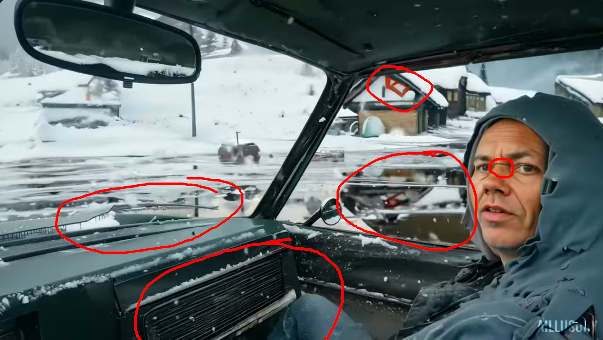
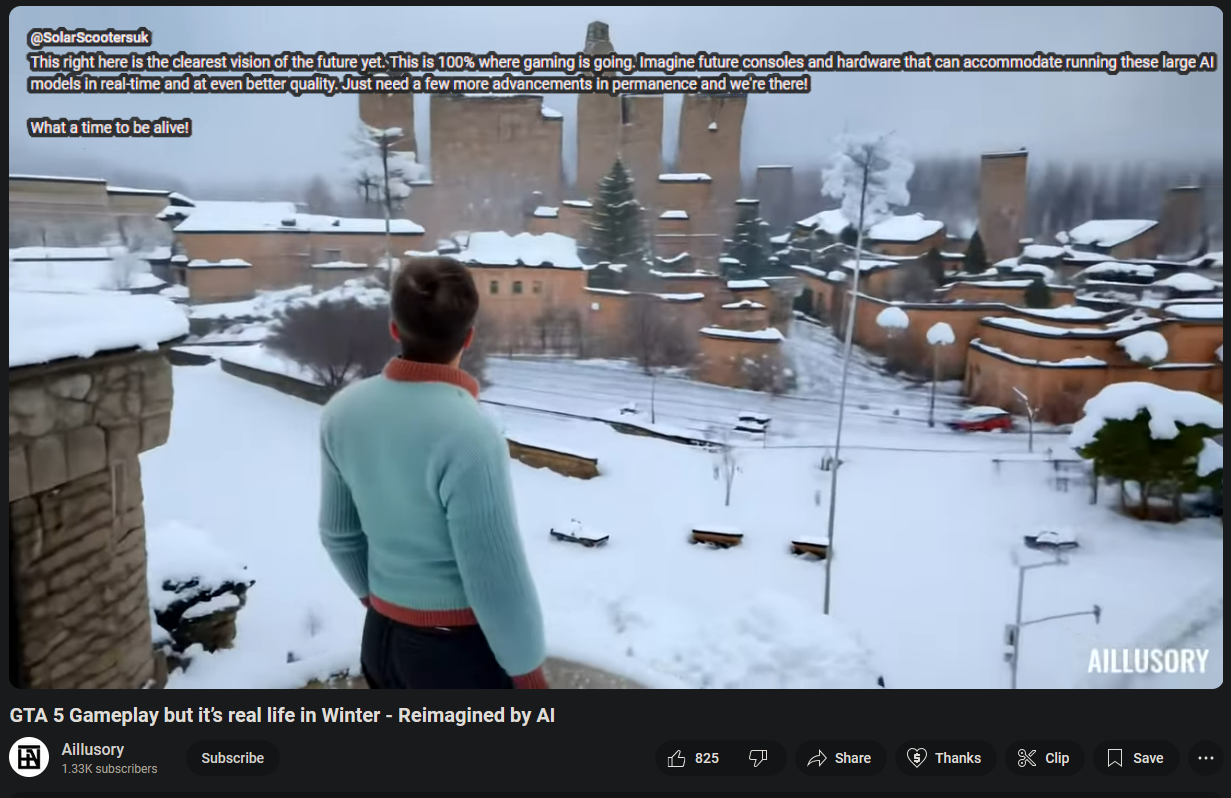
That’s a helpful checklist! Just tried on this image from a recent post about an AI-generated game video:

- Eyes and the face look surprisingly okay, except for that one deep line that goes right across his nose. Thought at first that he’s wearing glasses, but apparently he’s not.
- Reflections are inconsistent, there’s a car reflecting on the ice when there is no car that could cast that reflection
- I guess whoever published that picture was smart enough to pick a frame that doesn’t show hands… No buttons on the jacket, either
- I’m not sure what a car dashboard is supposed to look like, but this does not look right
- Weird detail: WTF is that red thingy on the house supposed to be
- This particular one gets watermarked by the AI, but I’m trying to learn how to spot it without that
Good quote, indeed they’re getting hard to spot, it made a very realistic face for the guy… I guess all I can do is practice to at least spot the most obvious ones. Surely they’ll be used a lot for misinformation in the coming decade, I want to be prepared.
Another tell-tale sign of AI is that things that should be aligned are not. If you look at the rear view mirror, you can see how the small switch at the bottom is placed off-center.
AI usually sucks at doing parallel lines and repetitive patterns. It is weird to have a grille where the glove compartment should be but if you look closer at that grille it is complete nonsense. It is the same thing with the A column that is an inconsistent mess.
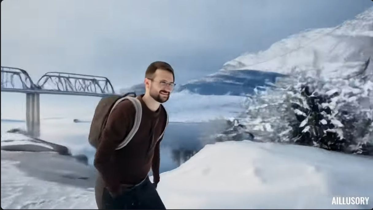
Next one… I think here, the main tell would be how the bridge disappears into nothingness? The thing the other people in this thread mentioned about little details being wrong. And the way how the metal rods that make up the bridge are unnaturally blurry/squiggly/whatever.
The reflection in the lake might be wrong, too, but I don’t really know how that’s supposed to look. Guy’s face is a little blurry, but I could be convinced that that’s bad camera settings if not for the bridge. He’s wearing a clothing that doesn’t have buttons. Right hand looks normal, but left hand is unnaturally tiny, even if well-formed.
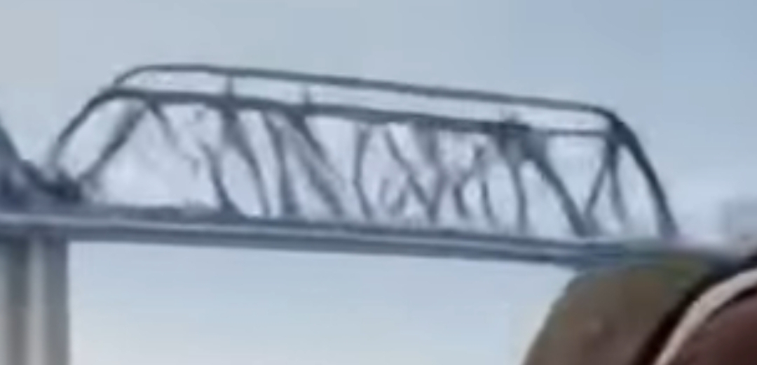 this is actually just the normal state of infrastructure in the US
Wears a wire under a shirt, lips are slightly unusual if you look at them, elbow on the right hand seems slightly too long, skin is smooth on neck, but that’s whatever. But background is more obvious.
But also, these two images are done very shittily, you can do compositing and layering so background won’t be blurry and anatomy wouldn’t be so wrong
That guys’s hood is tattered in a very specific, odd way. The fabric also has an oddly smooth texture.
Nice catch! The line across the bridge of the nose is a definite tell. You mentioned glasses, and I think the AI pulled from images of some people with glasses and some without, so it generated the bridge but rest of them.
The face also lit wrongly (it’s winter, it will be whiter), the edges of cloth are wrong, the shoulder is giant actually
I think that red thingy on the house is their attempt at putting a basketball hoop on the garage.
AI pictures are often too smooth. Like you can’t see pixels in photos or there’s no brushstrokes for digital paintings. Here’s a digital painting done professionally:
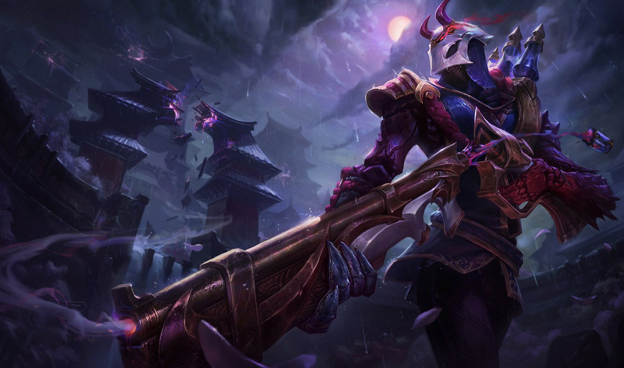
Notice on the waist how you can see where the artist started and stopped with their colors, despite the rest of the image having really good blending.
Here’s the same character done by Stable Diffusion:
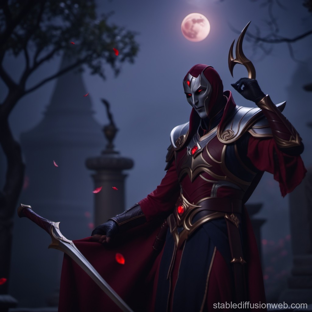
Zero brushstrokes. The lighting isn’t stylized. The background is too in-focus.
You’ll notice this with photos of people, too. There won’t be any skin blemishes or easily seen pixels if you zoom in.
Yeah, here the moon is red tinted, but the reflection from the silver colored armor is neutral to blue. That’s either an inexperienced artist or AI. Also, the shadows can’t seem to agree on where the blueish light is coming from. The head’s shadow is sorta where the moon would cast it, but then the front of the chest armor is reflecting light where it should be cast in shadow from the moon.
Also, more obviously, the sword is just floating there next to their third knee (they’re standing, presumably on two legs, but their cloak appears to be just floating there in the bottom left).
Note how none of the objects are objects. The fasteners on the shoulders are smeary blobs, not representations of anything. The gem on the breastplate, on close examination, isn’t a gem. It’s a red blob. What is that thing sticking out of the left arm? It’s nothing, it’s just pixels stuck together by a machine.
Looking at detail in general, especially stuff that’s complex like wrinkles, knots, frills and patterns around edges. AI is really bad at small details like that and keeping them stable, especially when compared with each other. Perspective can be really off too sometimes. Other stuff to look for: hair strands, the height of trees in the background, clouds, clothing trim, reflections, etc.
I heard if you use Photoshop (or something similar) you can use that to show JPG artifacting in machine-sludge images too even if they’re lossless files, though I didn’t fully grasp that fully.
Spotting errors like fingers is getting harder, however, what I usually notice now (and look for) is a ‘glossiness’ that they have. The AI images tend to have this sheen. Including on surfaces that would otherwise be matte, or even shinier surfaces that would normally be a bit less shiny. It’s as though a filter has been applied over it to make it more slick (like both oil slick slick and ‘professional’ slick slick).
Do you have examples of the glossiness?
None handy, I’ll comment in your other post if I come across any good examples.
Very in focus foreground and very blurred background where if you start to really look at it it makes no sense.
I guess? Lenses can have shallow depth of field, and it also could be the portrait mode of a smartphone camera that adds artificial blur.
Obviously it’s possible to achieve that affect with a camera and a wide open aperture. But it looks off and too defined of a difference in AI.
Human artists often make decisions based on reasons and if you ask “What’s going on over here?” and can anticipate an answer to that question, like “Some teacher or video told them that is how light works” or “They thought it looked cool”, that is probably a human. Human artists also struggle to create their art and AI doesn’t. It isn’t uncommon to find areas that it seems the artist spent way more time and energy on. Human artists use tools to create images while AI creates the images directly. If you look closely at real art you can often find brushstrokes or light and shadow work that are characteristic to some 3d modeling tools. In general, I feel like AI does really bad with lighting.
Fun little test for you
Note to anyone else trying it, the test doesn’t score you, so don’t submit unless you’ve saved your answers.
Here’s the answer key:
spoiler
Angel Woman: H
Saint In Mountains: H
Blue Hair Anime Girl: H
Girl In Field: A
Double Starship: H
Bright Jumble Woman: A
Cherub: A
Praying In Garden: H
Tropical Garden: H
Ancient Gate: A
Green Hills: A
Bucolic Scene: H
Anime Girl In Black: A
Fancy Car: H
Greek Temple: H
String Doll: A
Angry Crosses: A
Rainbow Girl: H
Creepy Skull: H
Leafy Lane: A
Ice Princess: A
Celestial Display: H
Mother And Child: A
Fractured Lady: A
Giant Ship: H
Muscular Man: A
Minaret Boat: A
Purple Squares: H
People Sitting: H
Riverside Cafe: A
Serene River: H
Turtle House: A
Still Life: A
Wounded Christ: H
White Blob: H
Weird Bird: A
Ominous Ruin: A
Vague Figures: H
Dragon Lady: A
White Flag: H
Woman Unicorn: H
Rooftops: A
City Street: A
Pretty Lake: A
Landing Craft: A
Flailing Limbs: H
Colorful Town: H
Mediterranean Town: A
Punk Robot: A
I got 7 or 8 wrong
 better than https://sightengine.com/ai-or-not where i get like 60-70 %
spoiler
Giant Ship: H
Muscular Man: A
Angry Crosses: A
Bright Jumble Woman: A
Riverside Cafe: A
Still Life: A
Mediterranean Town: A (this one genuinely fucks with me, did they force it to draw this over sketch?)
(also wounded christ passed only cause i remember being weirded out by that painting anatomy)
A lot of people who use AI Generated pictures are lazy, so most of them use very simple prompts which results in most of the ones having humans who look way too fake, sometimes they look like they are made out of plastic and very cartoony
It’s getting less reliable, but look at the details of complex objects. The computational plagiarism engines can’t think, and can’t do abstract concepts. They fuck up hands because they don’t have a concept of “hand” as a category of objects with fingers on the end of arms that grasp things. They’re not drawing hands, they’re putting pixels where those pixels are statistically probable.
So, look at complex objects - jewelry, buckles, electronics, guns, anything complex. The plagiarism engine doesn’t “'know” what those things are. It doesn’t know what buttons are or that buckles fasten things together. It’s just putting pixels in statistically probable positions. Hence those objects tend to be smears of color and light and dark without actual details. That smearing is still present in many images even as the machines become more sophisticated. The boundaries between things are indistinct and wrong because the machine doesn’t “know” what things, objects, concepts, are.
jpeg artifacts in images that were never a jpeg
But how do you figure out that an image was never a JPEG? Thought JPEG is the most natural format for photos and such, the sort of thing that people would want to fake using “AI”.
People don’t convert jpegs into lossless formats like PNG very often, if at all.
yeah idk if all the things output png but a lot of them do
i think the easiest thing is inconsistencies. easiest way to spot that would be if something is drawn multiple times, it’s drawn differently. i’ve seen eye highlights be drawn completely differently in each eye, for example. check elements that are repeated a lot in the background in places that aren’t attached.
elements that are repeated a lot in the background in places that aren’t attached.
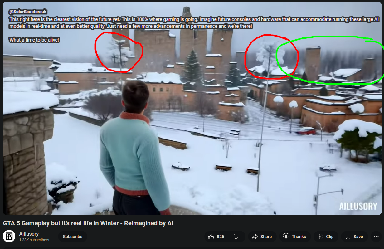
Would the background “forest” in this “AI”-generated image be an example of this? The one that I circled in green. It looks oddly repetitive, I don’t think natural forests are this regular…
Ah my advice was mostly for digital drawing stuff as that’s what I look at most often, oops
I think in this I’m drawn to the buildings and snow. they kind of look like they’re bleeding into each other and aren’t as rigid as they should be. but yea, the trees definetly look off. to get that sorta blur you’d have to blur the background or have a camera’s focal length set to… whatever i don’t know shit about cameras. that happens in photography of landscapes a lot, but doesn’t make sense to be right next to something that isn’t blurred at all.
Oh, and now that you point it out, you’re right, some of the buildings are curved in a way that I don’t think physics support…
Advice for digital drawings is good, too (I sometimes look at digital drawings and share the ones that I liked, wouldn’t want to be accidentally promoting “AI” stuff because I didn’t notice), I just kinda picked the first picture that I had at hand for practice
That image is all kinds of fucked up. Like there are serious alien geometries in it.
you mostly can’t, it’ll be even harder in 6 months and anyone who really says otherwise is coping
As of now, most AI pics have a weird saturation and are weird on little random details. But if you traveled back in time to 2018 and showed people those pictures, 99% of them wouldn’t even bat an eye. And even those issues will be quickly solved
I’m really hoping someone will figure out how to effectively poison hte well because I am experiencing legit despair looking at thsse things.
One of the things left out of the luddite narrative is that while the looms were very good at producing cheap and abundant cloth they didn’t produce good cloth. Hand weaving by true experts could produce fabrics of a quality and fineness that doesn’t exist anymore. When the looms destroyed craft weaving those secrets of the trade were lost. Entire categories of fine fabrics don’t exist now, can’t be had for love nor money because no one knows how to make them. At most a handful of hobby weavers might be able to produce very limited amounts.
Being able to produce vast amounts of cheap, good enough fabric was mostly a huge boon as it brought the cost of clothing down enormously. But we don’t need infinite cheap good enough art. And if what happened to all the crafts - the replacement of skilled craftspeople and masters with good enough mass production, with the loss of all those trade secrets and skills - happens to art we will be incomprehensibly poorer for it. The Mona Lisa hinges on a few brush strokes that set it apart from other pieces.
I don’t disagree that it’s rapidly going to become more difficult, but to say that you can’t currently? I don’t think I or any other young person I know has ever fallen for an ai image.
What can be difficult to spot in the same way that good CGI is, is when human efforts combine with ai.
I don’t think I or any other young person I know has ever fallen for an ai image.
lol. lmao even
Bear in mind that many of the answers here also apply to artists who are inexperienced or have low technical skill
Luck
As ai gets more capable, the functional ‘tells’ will become less apparent. I think the main thing is context clues surrounding the images source or the ‘artists’ background.
