
We’re not brigading, it was on our feed.
Stay away fools!
Cuz love rules!
At the Love Shack
instantly embedded in my head
Nickelback
ROCKS!deleted by creator
It’s an advertisement for invisible ink sharpies.
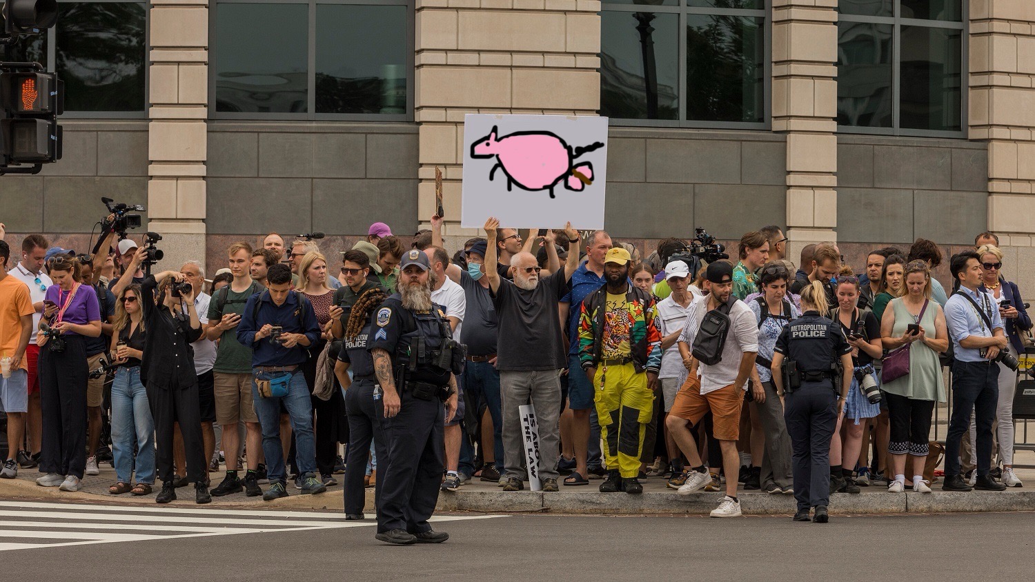
its about the mets baby love the mets go mets baby get a home run love the mets
 thinks metropolitan police and mets are from the same place
KONS TY TUC JA
Koyaanisqatsi?
-–
Koyaanisqatsi (koh-YAH-nis-KAHT-see), also known as Koyaanisqatsi: Life Out of Balance, is a 1982 American experimental non-narrative film directed and produced by Godfrey Reggio with music composed by Philip Glass and cinematography by Ron Fricke. The film consists primarily of slow motion and time-lapse footage (some of it in reverse) of cities and many natural landscapes across the United States. The visual tone poem contains neither dialogue nor a vocalized narration…
Nah, sorry I’m just 🇵🇱Polish🇵🇱.
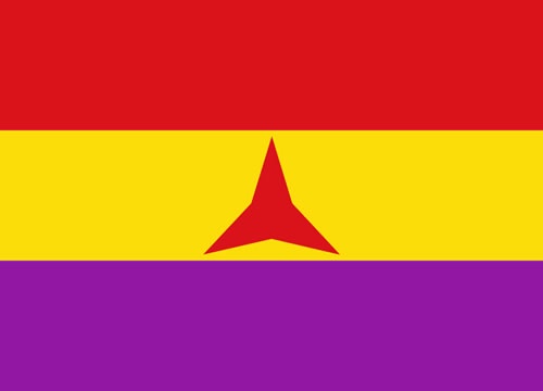
It’s in reference to artwork made by Luka Rayski that has been adopted far and wide by our main opposition parties coaliton; Koalicja Obywatelska. Who also used a similar art style in their own logo.
What they both mean is:
Contitution = Kontytucja; Ty = You; Ja = Me; Obywatel = Citizen
CW: Cognitohazard
Here is more of the fuckers art: https://lukarayski.tumblr.com/
It’s the Polish equivelant to “Vote.” and “I’m with her”. It fucking sucks, and it contains a very neoliberal message. The art style itself is something I despise, almost all of “ledt wing” politcal “art” and cartoons are made in this lazy, “cutesy”, “relatable” art style. And I’m talking mainstream shit. It’s everywhere and I can’t stand it because I immieadietly associate it with a lukewarm message or a genuinly bad take. Yes we also have a boomer right winger art style here and it’s just as fucking annoying.
Also, :poland-cool:
The stand user is to my left


